Annabella Fudge-Harman, shares her insights as an interior designer with first hand experience caring for her husband Danny, who was diagnosed with Motor Neurones Disease 11 years ago.

Balancing Practicality and Beauty in Accessible Design
What I don't know about accessibility and interior design, isn't worth knowing. I mean, I know it's not the most glamorous area of interior design to talk about, but it's something that's exceptionally close to my heart. Floor levels, wheelchairs, hoists, toilets, wet rooms, ramps, electric beds, riser recliner chairs.
You name it, I know ALL about it. My darling husband is in his 11th year of battling with Motor Neurone Disease and over the years we have been through many a situation where we need to think about the practically about space we have, but critically, we want to keep everything looking gorgeous so we can pretend, happily, that our lives do not revolve around MND.
Planning Every Detail: Refurbishing for Accessibility and Freedom
We totally refurbished a bungalow a few years ago, I thought about everything in the tiniest of detail. It isn’t the biggest bungalow in the world so I really had to get the space right due to the wheelchair and the accessible furniture we already owned.
When we pulled our bungalow apart, I remember mapping out what looked like an assault course in our apartment to try and work out the angles that I would need to create in order for Danny to get around freely. I used everything from wine glasses to hoovers to map out my course, down to the millimetre, and I am so glad I did.
Despite my hard work and precision mapping, of course, we have had a fair few chips here and there over the years. It is a standing joke in our house with the carers; watch the walls!


Adapting to Change: Overcoming Design Challenges and Unexpected Hiccups
In hindsight, there are a few things I wouldn't have done, and a few things that I didn't account for. At the time, the wheelchair was a standard size; because my husband’s disease is so slow in its progression, and wheelchair use was very new to us at this stage, I hadn't thought about the fact that over the years, the wheelchair would eventually need to get bigger and become more supportive. The size of the wheelchair would of course have an effect on my assault course!
Doors can be quite a hinderance when you're moving around with a wheelchair, you need to open them to go through, but you're pushing at the back. I did try to incorporate as many pocket doors as I could, and certainly double doors where possible because maximises the about of space you have, and the turning circle.
I once had a conversation with an occupational therapist regarding a ceiling gantry hoist, they said ideally the hoist would be able to collect Danny from the bed, and take him straight through to the en-suite. I thought my next question was really stupid, I said, "what, so, through the wall?" turns out, my question wasn't stupid. They said "well, yes, the wall would have to come down".
The wall in question was for our wet room. I mean, I don't think you need to be an interior designer to work out this was a ridiculous idea, and of course the wall should certainly not come down, unless you fancied drenching your bedroom and all of its electrics on a daily basis.
I had pondered this idea for a while, and thought about all the people that might have trusted their judgement and taken walls down! The answer would be, and floor to ceiling opening, with a bi-folding double door, just enough room for Danny and I to swing through to the en-suite but not so much that the bedroom resembles a swimming pool. I fancied some shutter style doors, very Maldives hotel vibes.


Bringing Warmth and Comfort to Accessible Design
I cringe on, I would say, a weekly basis when I see accessible designs within the home and other care facilities, due to the lack of thought and warmth in accessible design.
When you think of hospitals or accessible equipment, what colours do you think of? White? Grey? Blue? All put together with the most sterile materials on the planet. Don't get me wrong, there is of course a practically to that but wouldn't it be great if we could just inject a little more life and comfort into it.
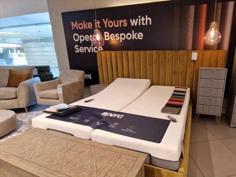
Years ago, we had a conversation with an occupational therapist, who was pretty much insistent that we must remove out gorgeous super king adjustable bed and replace it with a single hospital bed for Danny. I had two main issues with this; firstly, where am I going to sleep?! Are we top and tailing?! And secondly, my husband is terminally ill, he does not want to spend the rest of his days in a hospital bed without me to comfort him. Not to mention, it would instantaneously ruin the whole cosy and relaxing environment I was trying to create for us.
I am so glad I pushed back on this, we still have our gorgeous big bed which goes up and down so we can move Danny, and I changed the mattress for him, one of the ones which almost rocks you from side to side to relieve the pressure and he sleeps like a baby. We battled for years with Danny’s sleep; he just could not get comfortable. You may know Motor Neurone Disease is muscle wasting, so he is very slight and his bones struggle to find a comfortable position. This in turn meant that I would be awake a heck of a lot; rolling him from side to side, trying to get the right position.
It was an incredibly frustrating time so I cannot tell you how pleased we both were when his mattress arrived and he was able to have a good night’s sleep. The mattress has a beautifully quiet pump which inflates and deflates in various points to take the pressure off of his bones. To be honest, the mattress is absolutely brilliant, I would quite like one myself!
Accessible interior design doesn't have to be black and white, there are ways around things without turning your home into something that resembles a hospital.


Partnering with Opera Beds: Finding the Perfect Solution for Comfort and Accessibility
At Opera Beds, we understand the unique challenges of creating a home that’s both functional and beautiful, especially when accessibility needs are involved. Just like Annabella, many of our customers want their space to feel like home, not a hospital room. That’s why we offer a range of profiling beds and pressure-relieving mattresses designed with both comfort and accessibility in mind.
Find your perfect solution today
Discover the difference the right bed can make for yourself. Visit an Opera showroom in person or by video and have our team guide you through the range.


